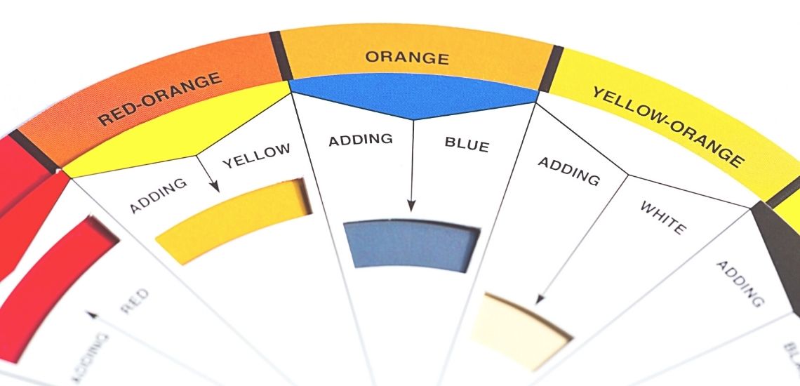
If you want to create beautiful, expressive acrylic paintings that touch people’s emotions, then your knowledge of color theory and Johannes Itten’s work is essential. Johannes Itten’s color circle from 1961 is widespread. This successful artist was able to depict the relationships between the different colors with just a few shades. This makes it easier for the viewer’s eyes than other systems that contain confusing combinations. Johannes Itten was an influential Swiss painter and art theorist who developed color theory in Weimar, Germany. In particular, he studied how different colors interact with each other to create visually impressive effects. Its basic idea is that you can mix any other color with just three main colors. Ilten’s color theory is therefore considered an absolutely remarkable tool for strong color art today.
The colors of the color wheel
Using 12 colors in Itten’s color wheel is an important part of any design. These include the three primary colors yellow, red, and blue, as well as their secondary counterparts green, purple, and orange.
Six other intermediate colors are part of this color wheel: yellow-orange (a mixture of yellow and orange), red-orange (red mixed with orange), blue-purple (blue mixed with purple), lilac-red (red mixed with purple) and yellow-green (yellow mixed with green). As you can see, many new colors and tones are created from three basic colors.
Conclusion: Johannes Itten’s work in Weimar, Germany, laid the foundation for modern color theory. His basic idea is that you can mix all shades with just three main colors. Itten’s findings are still relevant today when you conjure up strong works of art on white canvases.
Art and experimenting with colors are the journey of free soul.
Artifalir
What are the primary colors?
The primary colors, often called “first order colors” or primary colors, are the first color schemes that people associate with a particular shade.
These are:
- Magenta
- Cadmium yellow
- Cyan blue
All other bright colors can be made from the three basic colors, red, yellow and blue. It is important to know that these base colors cannot be made by other mixtures.
What belongs to the secondary colors?
The secondary colors are also called “second-order” colors. They are created by mixing two primary colors in each case. For example, red and yellow produce orange. No white or black is added to secondary colors, so they retain their purity.
How are tertiary colors created?
The tertiary colors are a mixture of two other shades of the color wheel. They can be created by mixing equal concentrations of primary and secondary colors to create new shades. The first three species are teal, blue-violet, and crimson.
What are non-colors?
Itten describes black and white as “non-colors.” The so-called “non-colors,” they are called that because these shades do not occur in nature, but are created by additives (white) or subtractive (black).
The complementary colors
Complementary colors are the colors that are directly opposite each other on the color wheel. The word “complementary” comes from Latin “complementary” and means “something that completes or improves.” This correspondence between the color pairs creates harmony by balancing lighter and darker hues, warm and cool tones. There is only one complementary color for each shade.
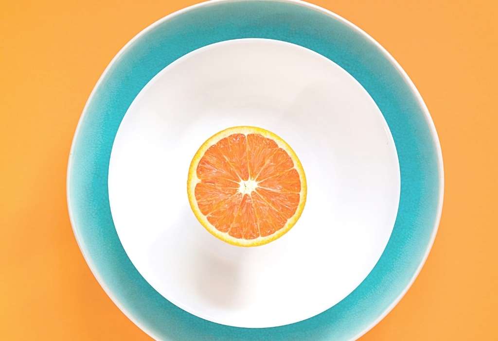
Many people think they can best achieve a darker blue by adding black. But that’s not true! The complementary color for dark blue tones is orange.
The color contrast
The way colors are used to create a particular effect can also be seen as an interval between two different effects. For example, if you have a dark blue sky with light pink clouds, it not only looks aesthetically pleasing, but it also gives an interesting color contrast.
The 7 main contrasts of Johannes Itten:
Light-dark contrast: The dark area next to the light one is so intense that it seems like they cancel each other out.
Color-to-self contrast: When at least two colors come together in a pure and unbroken form, it often creates a colorful contrast, as if they were paired together, rather than combining them into an overall mix.
Cold-warm contrast: Red, yellow and orange tones are perceived as warm. Teal is more likely to be perceived as a cold color because it is farther away from us than other colors when viewed directly or in the same light on both sides. In art, this creates a distance between objects due to their visual structure (e.g. a large area compared to a small one).
Quality contrast: Quality contrast is the difference between pure colors and mixed colors. For example, if you combine a very colorful, vibrant color with an unbroken, dull version, you’ll get a less intense version of both colors because they’re interrupted by other elements that take away their vibrancy or brightness.
Quantity contrast: The volume contrast is created by juxtaposing colored areas of different sizes. For example, an image with a large yellow area and a small blue area has a very different effect than the other way around, because we see more detail in the bright colors, while everything else becomes less vivid.
Complementary contrast: The complementary colors are next to each other and therefore have an interesting effect on the eye.
Simultaneous contrast: The simultaneous contrast provides a breathtaking play of colors. In this constellation, a complementary color is removed from the base set.
Conclusion: Expand your general knowledge!
To paint colorful acrylic paintings, you need more than just artistic talent. It’s also about understanding the science behind the different colors.

